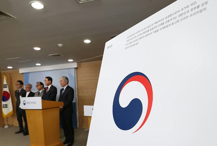
Minister of Culture, Sports and Tourism Kim Jongdeok (left) and Vice Minister of the Interior Kim Sung-lyul (right) unveil Korea’s new ‘government identity,’ or logo, at the government complex in Seoul on March 15.
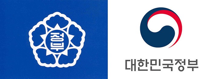
Korea has changed its official “government identity.” The previous logo, similar to a hibiscus, is no more and the new sign will resemble the nation’s taegeukcircle of three colors. The ministries will also all use this new logo instead of a sign for their own logos.
The Ministry of Culture, Sports and Tourism, together with the Ministry of the Interior, unveiled the new mark on March 15.

Korea will change its official government insignia from a hibiscus (left) to a taegeuk (right).
The government states that the new logo conveys the dynamism and enthusiasm of Korea with the three colors of blue, red and white, echoing off the national Taegeukgi flag with the taegeuk circular swirl and the blank canvas embodied in white. The typeface was inspired by the font used in the “Hunminjeongeum” (1446), the original Hangeul text, in consideration of the harmony embodied in the taegeuk circle.
The Korean government has been using the blue hibiscus sign since 1949, and from the late 1990s each ministry and government agency developed and used its own logo. The government claims that this caused budget waste and administrative inefficiency, since each government organization had to develop its own new logo, and claims that public awareness was inconsistent and often low. This government, thus, since March 2015 has been working on developing a new government logo that could be used in each ministry and government agency.

The new taegeuk logo conveys the dynamism and enthusiasm of Korea, the government states.
The new logo will be used at all 22 ministries and 51 central government agencies starting in May after relevant laws begin to be amended starting later this March.
By Chang Iou-chung
Korea.net Staff Writer
Photos: Jeon So-hyang, Ministry of Culture, Sports and Tourism
icchang@korea.kr


