
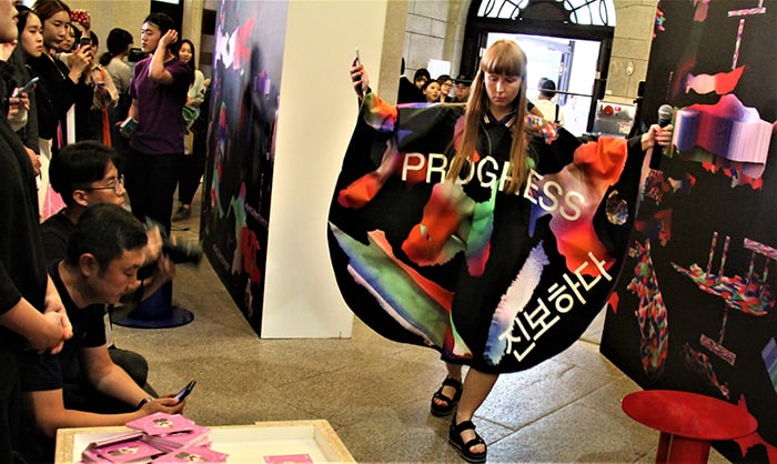
Czech graphic designer Tereza Ruller showcases her participative performance ‘Inhabit a Planet’ during the opening ceremony for the fifth International Typography Biennale, at Culture Station Seoul 284 on Sept. 15.
By Xu Aiying and Lee Hana
Photos = Xu Aiying
Seoul | Sept. 15, 2017
“Before the invention of letters, the body was our communication medium. Even today, the body is still one of the most important means of communication. Typography is what is created when speech and writing, expressed through our bodies, are captured in letter form and given artistic value.”
This is how Ahn Byunghak, director of the fifth International Typography Biennale, described his vision behind this year’s exhibit. Themed on “the body,” this year’s biennale kicked off at Culture Station Seoul 284, the old Seoul Station, on Sept. 15.
The exhibition, first launched in 2001, brings together texts and images rendered by top designers from around the world. At this year’s biennale, visitors can expect to see some 216 works by designers from 14 countries, including the U.S., the U.K., Japan, Czechia and the Netherlands. Thematic zones include “A Chronicle of Writing,” “The Present and Beyond,” “Write in Red: Where Body Touches Typography” and “Letter, Image and the Senses,” among others.
The themed zone “A Chronicle of Writing: The Present and Beyond,” located on the first floor, showcases an exhibit that looks at the development of letters and characters, with East Asia as the background. The section examines the transformation of Hangeul typography through posters made for movies and exhibitions.
In another zone, “Flag,” visitors can take a look at how 14 designers view the body, expressed on waving graphic flags decorated with images and typography.
In the opening ceremony, Japanese graphic designer Yukimasa Okumura’s poster “Hiroshima Appeals Heiwa Ohashi” (2012) captured the attention of visitors. The poster shows Hiroshima’s Peace Bridge railing, a symbol of the Hiroshima bombing, as a painted image traced from an actual photograph.
Other notable works include “For Your Comfort and Security Please Remain Seated” by Swedish designer Catherine Anyango, a piece that interprets Seoul Station’s waiting room structure, chairs and typography. A digital installation featuring animations displayed on four vertical screens by U.S. design studio Thirst is also worthy of note.

Visitors take a look at works by Japanese graphic designer Yukimasa Okumura at the fifth International Typography Biennale, at Culture Station Seoul 284 on Sept. 15.
“We tried our best to deliver the body’s senses and intuition through typography as a medium. At the world’s only typography biennale, visitors will be able to discover the hidden meanings and potential of letters,” said director Ahn.
This year’s biennale will run until Oct. 29 and admission is free of charge.
xuaiy@korea.kr


