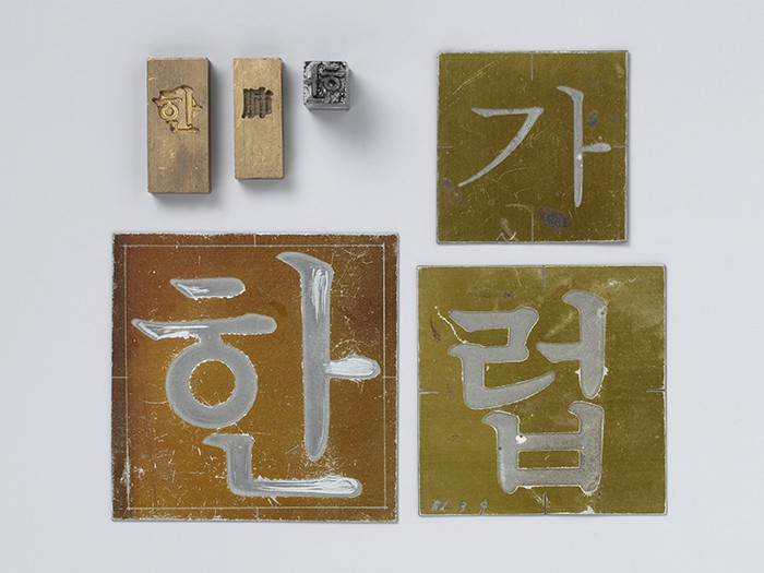
An exhibition introduces the original plates from a matrix engraving machine, a typeface matrix and a type cater machine, all of which were used to print the Batang font in the 1950s.
When creating a Hangeul document, one can easily find Batang or Dodum fonts as default, especially in the software program “Hangeul.” These fonts are neat and easy to read, and they are even dubbed the “national fonts.”
The fonts were developed by two of the first generation of font designers: Choe Jeong-ho (1916-1988) and Choe Jeong-sun (1917-2016). Both designers underwent difficulties in the 1950s after the Korean War, but they did not give up. They designed Hangeul fonts with faith.
To mark the 100th anniversary of the two master designers and to look back on their works and lives, the National Hangeul Museum and the King Sejong the Great Memorial Society are jointly hosting a special exhibition, “Wondo, Story of the Two Designers,” slated for Oct. 5 to Nov. 17.
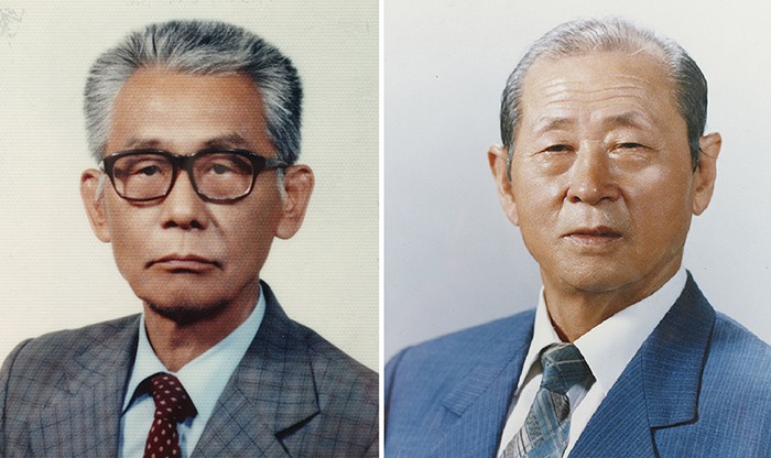
The first generation of Hangeul font designers: Choe Jeong-ho (left) (1916-1988) and Choe Jeong-sun (1917-2016).
The exhibition is composed of two parts: wondo, or original drawings for types, and the story of the two master font designers. The first part focuses on original drawings, tools and belongings left by the two designers. It also unveils 57 works from Choe Jeong-ho, including original drawings, blueprints and master film data for the first time.
The second part sheds new light on the two master designers, their words, thoughts and lives, related to font design. It also introduces Choe Jeong-ho’s faith, quoting him as saying, “Letters are a means to deliver thoughts and meanings. They should be designed to not make people tired when they read.”
These days, we can make new, unique fonts as often as possible with computers. In the past, however, we needed well-made original designs in order to make printed works look beautiful. Beautifully made original drawings made the printed works look nicer and more readable, which created harmony within the letters and syllabic blocks.
Such original drawings had to be handmade by someone who was skillful and who was good at artistic design. Mistakes were simply not acceptable, as even a very slight change in the shape or the width of a stroke could create a totally different impression. As this needed extreme accuracy, even if a well-trained designer worked more than 15 hours a day, they could only complete about 20 sheets of papers. However, none of this stopped the two designers. They were well aware of the importance of their fonts. They spent their whole lives working on every single font of all the Korean letters and possible syllabic block combinations by making original drawings, which helped produce various printed materials made with types based on their drawings.
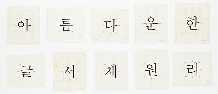
Choe Jeong-ho created the Myeongjo font (명조체) on request from the Japan-based font developing firm Morisawa.

Choe Jeong-ho created the Godik font (고딕체) on request from the Japan-based font developing firm Morisawa.
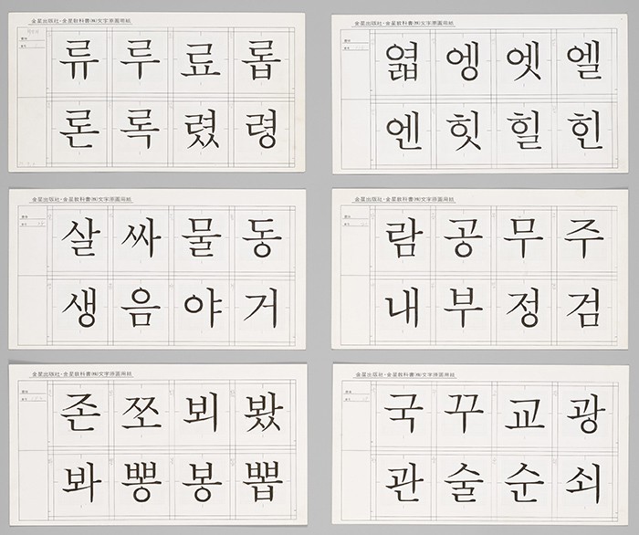
Choe Jeong-ho created the Choe Jeong-ho Font, naming it after himself.
Choe Jeong-ho completed the development of the Batang font (바탕체) and Dodum font (돋움체) both of which are suitable for publishing. His types created a sensation in the publication industry in the 1950s. Museum-goers can see his original drawings, blueprint films, and the original drawings he designed on request from the Japanese font maker Morisawa.
Another master designer, Choe Jeong-sun, created original drawings for types that became the roots for textbooks and newspapers. His types can be found in textbooks and publications by the Pyeonghwadang Printing Company (평화당) in the 1950s. He also designed flat-shaped fonts in the 1960s to open a new era in newspaper types. The type of the first issue of the JoongAng Ilbo newspaper was designed by him. The paper was printed with a flat-shaped type in a vertical direction in order to contain more content in the limited page space. Each type had enough space inside the letters and syllabic blocks so that it looked bigger and more readable.
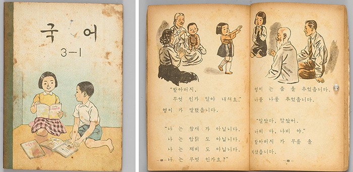
A Korean language textbook for elementary schools were printed in the Batang font in 1959. Choe Jeong-sun participated in the development of the font.
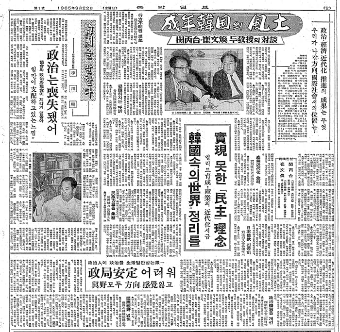
Choe Jeong-sun designed the type for the first issue of the JoongAng Ilbo newspaper, published in 1965.
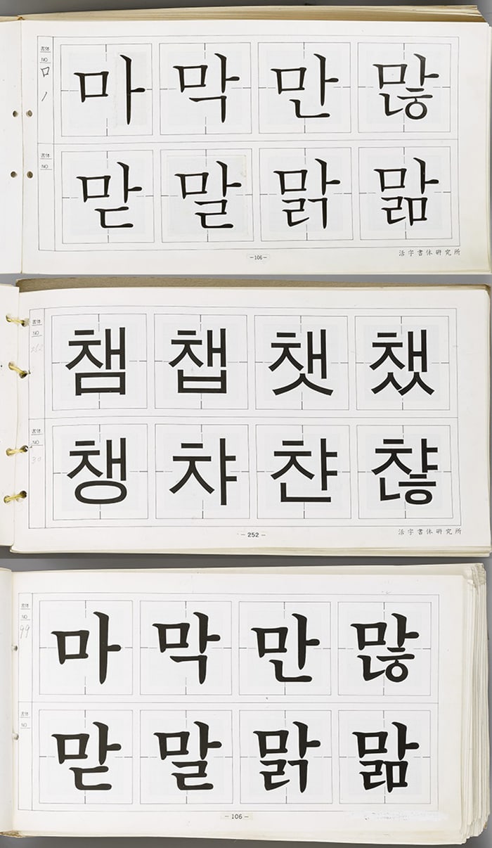
Choe Jeong-sun participated in the development of fonts for textbooks. He created the Batang font (top) and the Dodum font (middle) for the textbooks, and the Batang font for the titles (bottom) in 1991, 1992 and 1993, respectively.
The National Hangeul Museum praised the two designers, saying that, “We can find the types and fonts of their lifetime spirit and works still alive in textbooks published today, despite the times of turmoil right after the Korean War, newspapers that delivered the news every morning, encyclopedias that contained all the knowledge of the world, and novels that had all kinds of stories.”
More information about the exhibition is available from the website of the museum, serviced in Korean, English, Japanese and simplified Chinese. http://www.hangeul.go.kr/
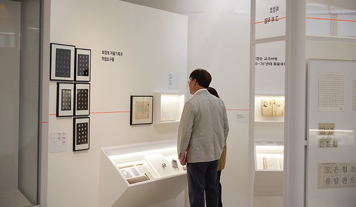
Visitors to the exhibition look at the works, records and tools of designer Choe Jeong-ho.
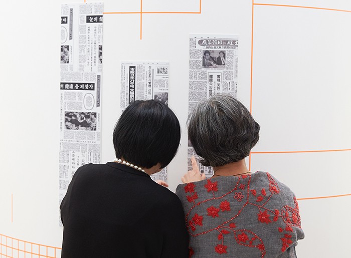
Visitors to the exhibition look at various newspaper print types on display.
By Yoon Sojung
Korea.net Staff Writer
Photos: National Hangeul Museum
arete@korea.kr


![[102nd March First Independence Movement Day] American journalist’s Seoul home to be opened to public](https://gangnam.com/file/2021/03/usr_1614255694426-218x150.jpg)


